FITNESSPARK
Fitnesspark Summer Campaign
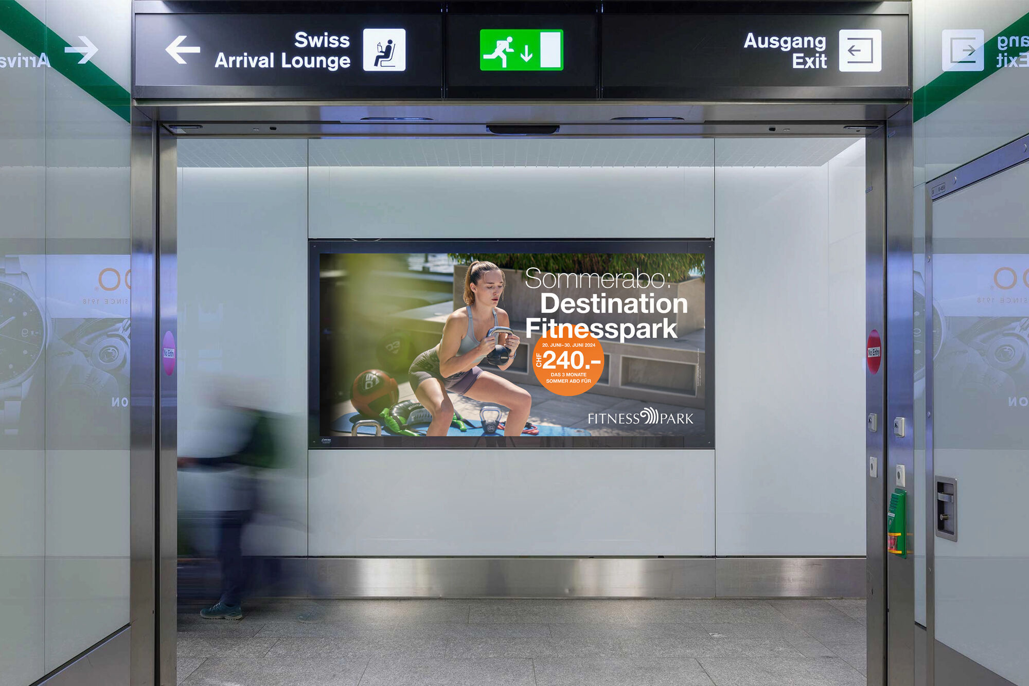
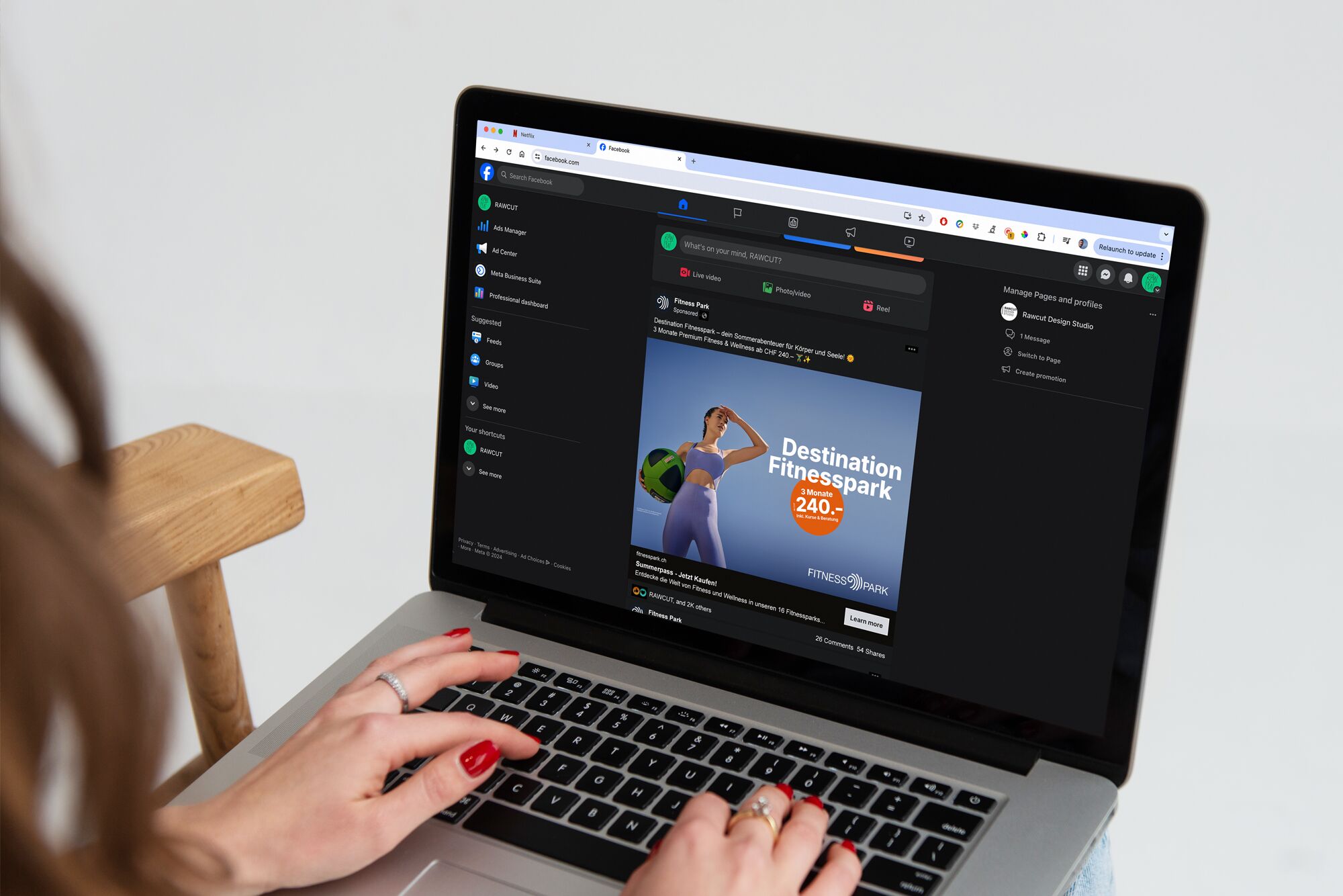
Fitnesspark was aiming for more than a visual refresh. The brand needed to evolve in content and design without losing its core. After years of consis
tent presence, it was time to make the premium positioning clearly visible. More distinctive. More contemporary. More precisely defined.
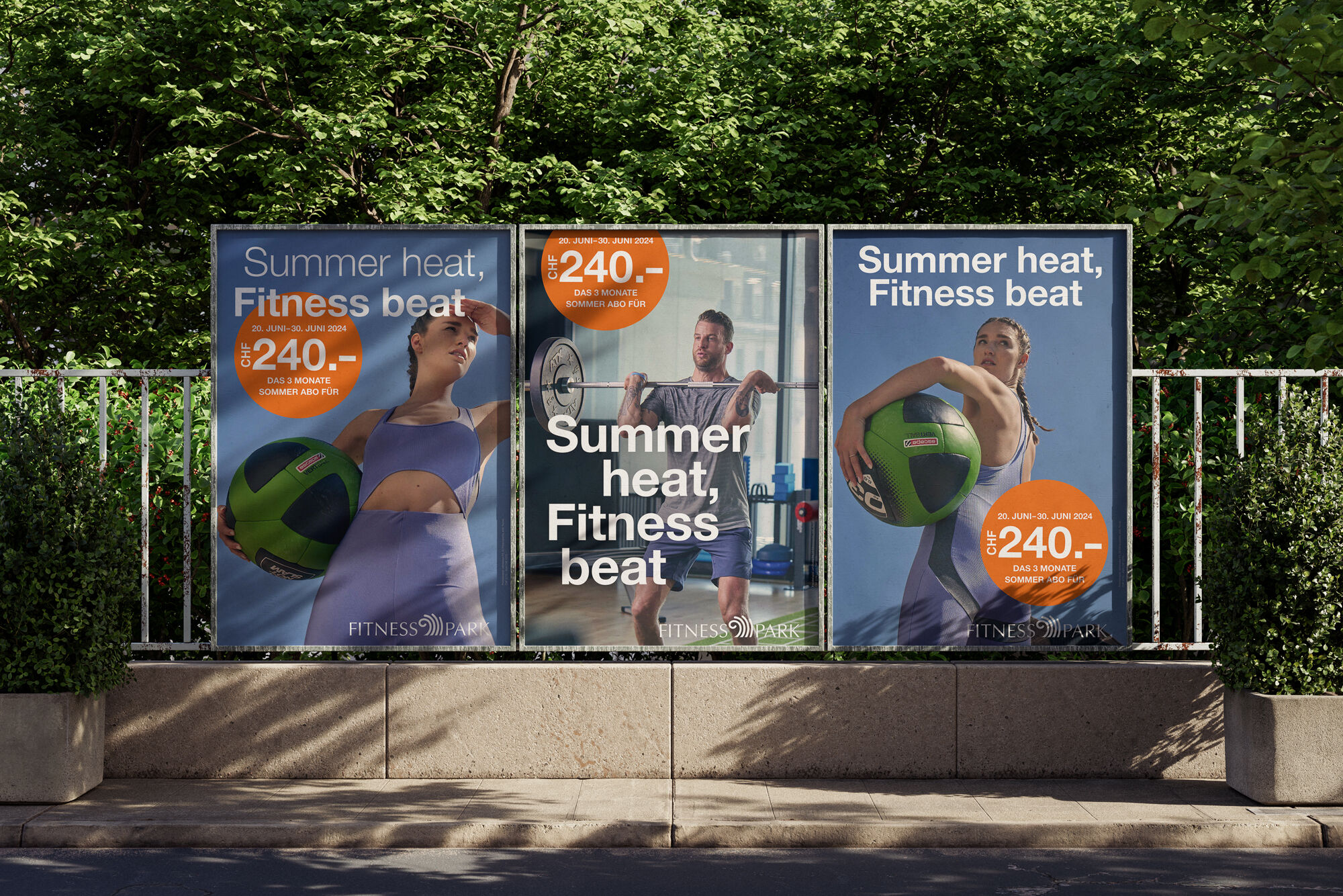
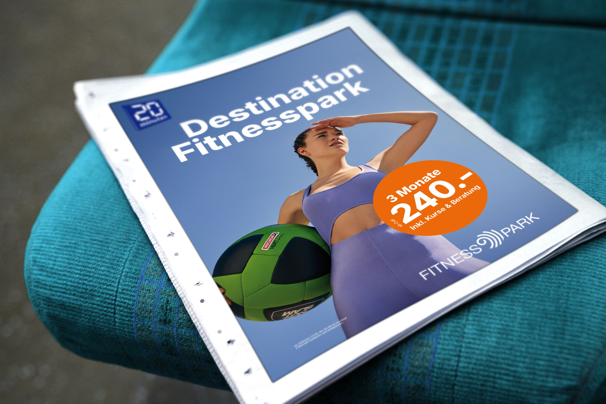
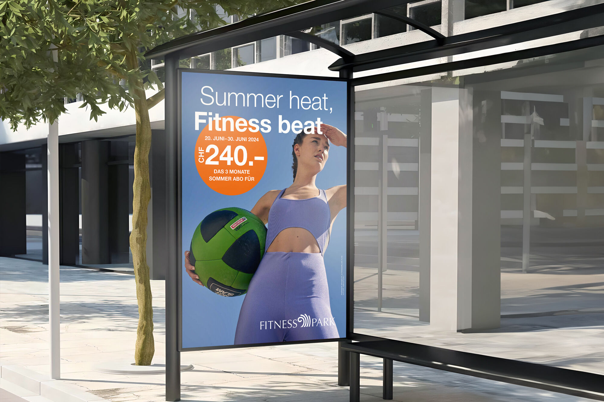
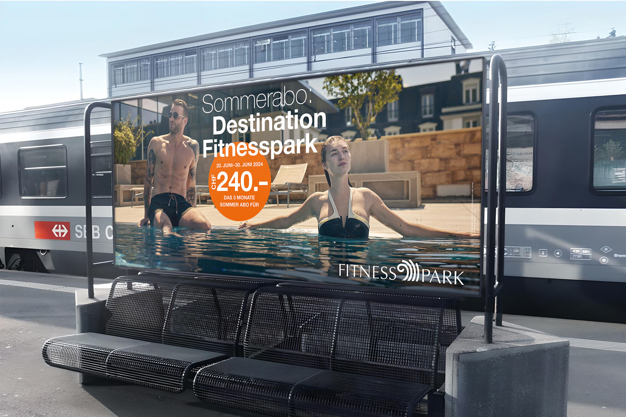
We developed a refined visual language that translates quality and attitude into atmosphere. At the center was a carefully defined color palette conveying calm and strength, guiding styling, set design and overall mood. Every creative decision contributed to a coherent brand experience.
The creative direction moved away from generic fitness aesthetics toward a cinematic approach. Inspired by subtle elegance and controlled tension, we created a visual world with presence and depth. The deliberate use of color theory and lighting enhanced brand recognition and strengthened differentiation in a competitive market.
The result is a sharpened brand aesthetic that resonates with existing members while attracting new audiences. Not a radical reinvention, but a clear evolution with character. show less
show moreWe developed a refined visual language that translates quality and attitude into atmosphere. At the center was a carefully defined color palette conveying calm and strength, guiding styling, set design and overall mood. Every creative decision contributed to a coherent brand experience.
The creative direction moved away from generic fitness aesthetics toward a cinematic approach. Inspired by subtle elegance and controlled tension, we created a visual world with presence and depth. The deliberate use of color theory and lighting enhanced brand recognition and strengthened differentiation in a competitive market.
The result is a sharpened brand aesthetic that resonates with existing members while attracting new audiences. Not a radical reinvention, but a clear evolution with character. show less