MERKUR
Rebranding & Packaging Design
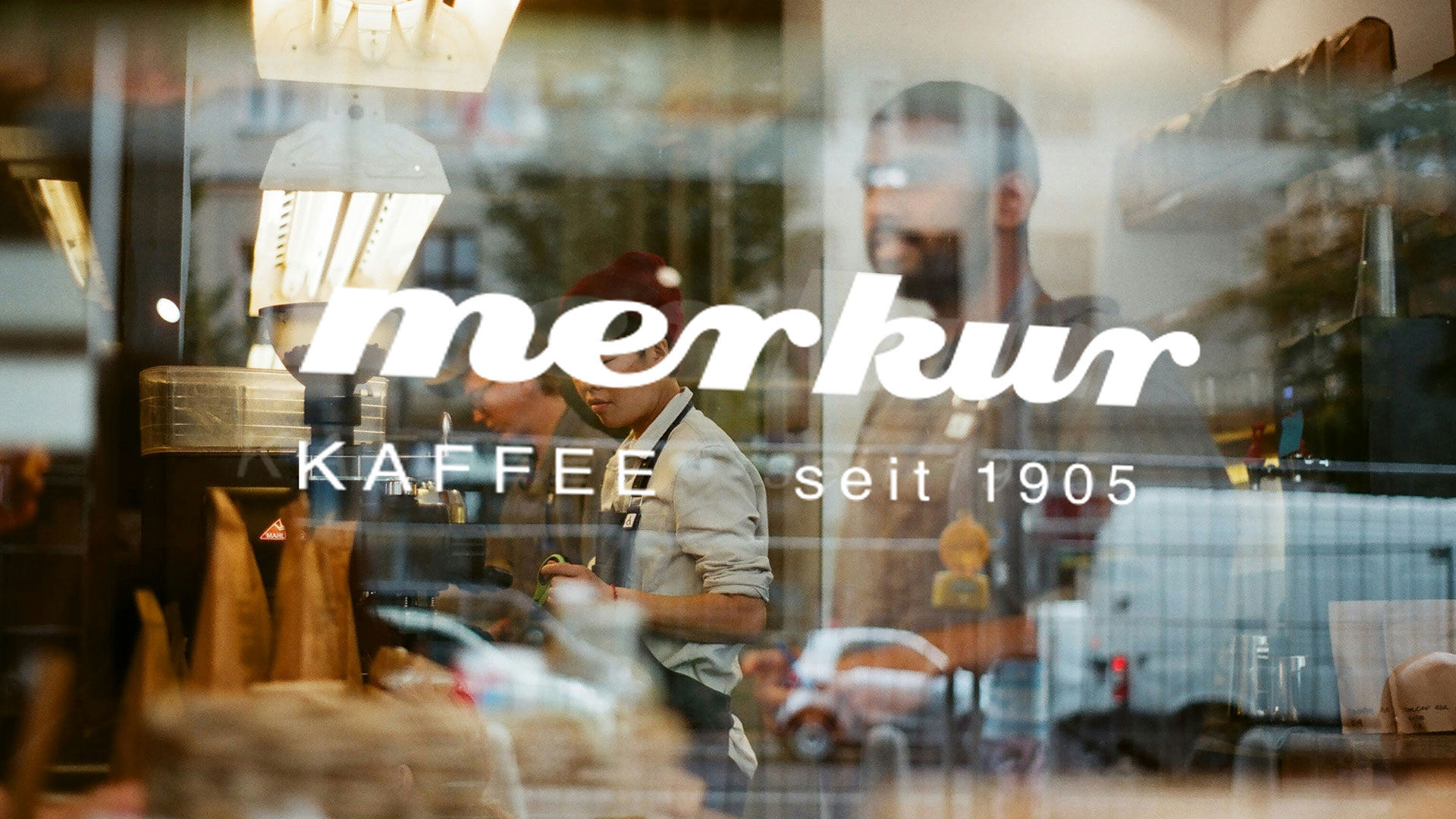
Merkur Kaffee is one of Switzerland’s most traditional coffee brands. The ambition was not to reinvent it, but to reposition it as a modern classic. W
e created a visual identity that bridges the original Merkur logo and the previous rebrand, translating heritage into a system built for today’s brand environments.
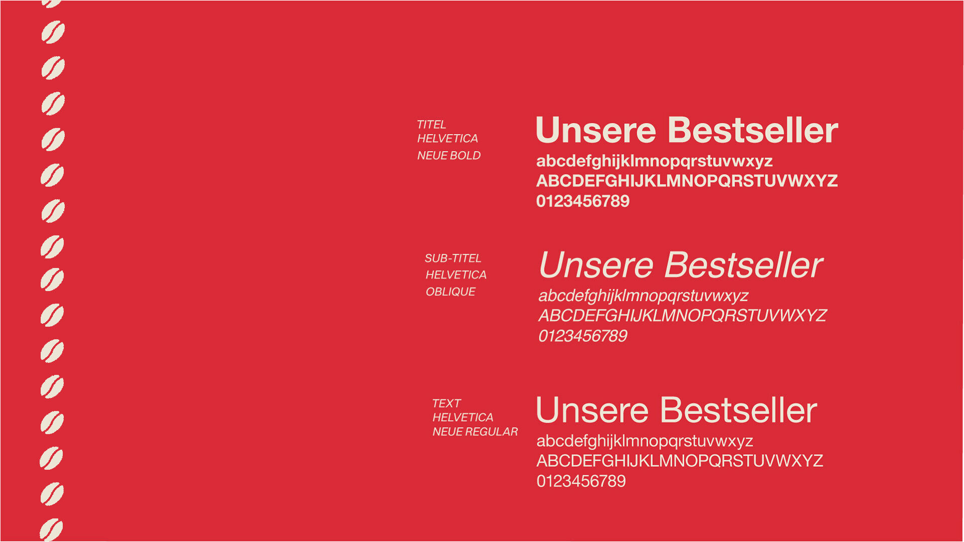
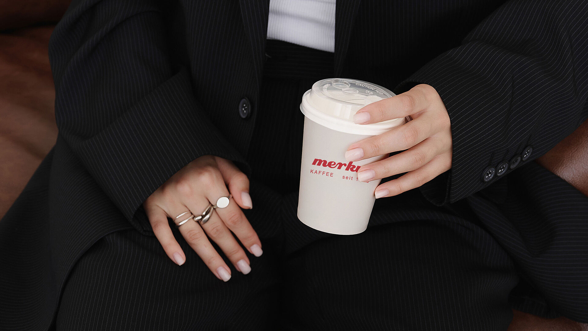
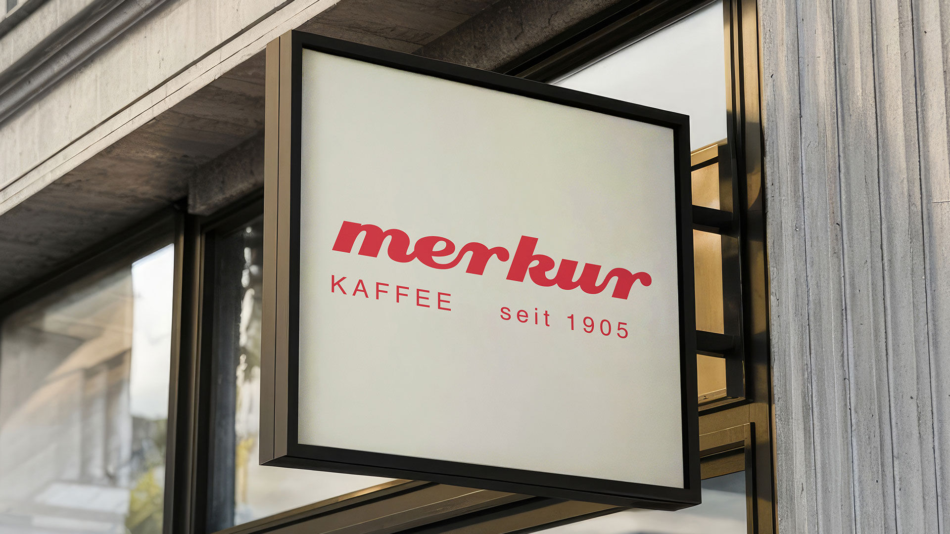
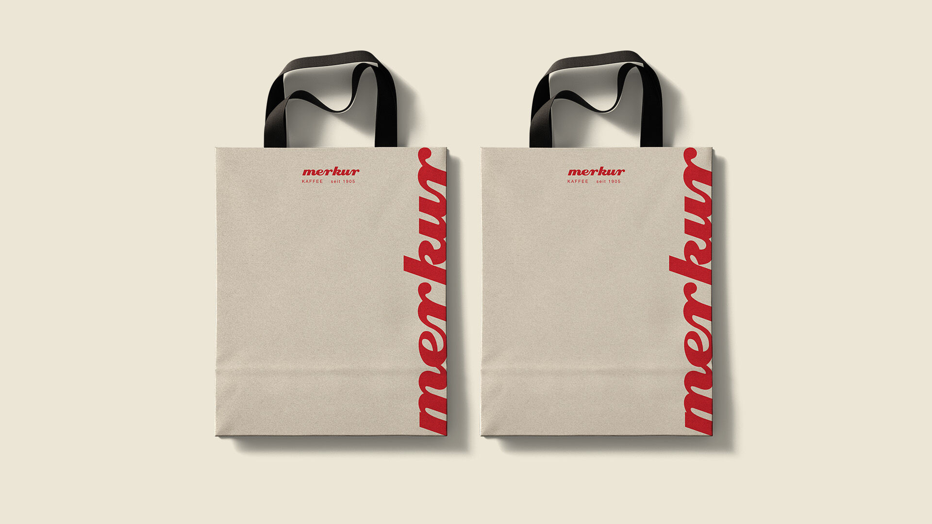
The new logo sharpens and simplifies the mark while preserving recognition. The typography subtly references the motion of pouring coffee, adding character without becoming decorative. The since 1905 byline anchors the brand in its legacy, supported by the deliberate use of Helvetica Neue as a Swiss typographic statement.
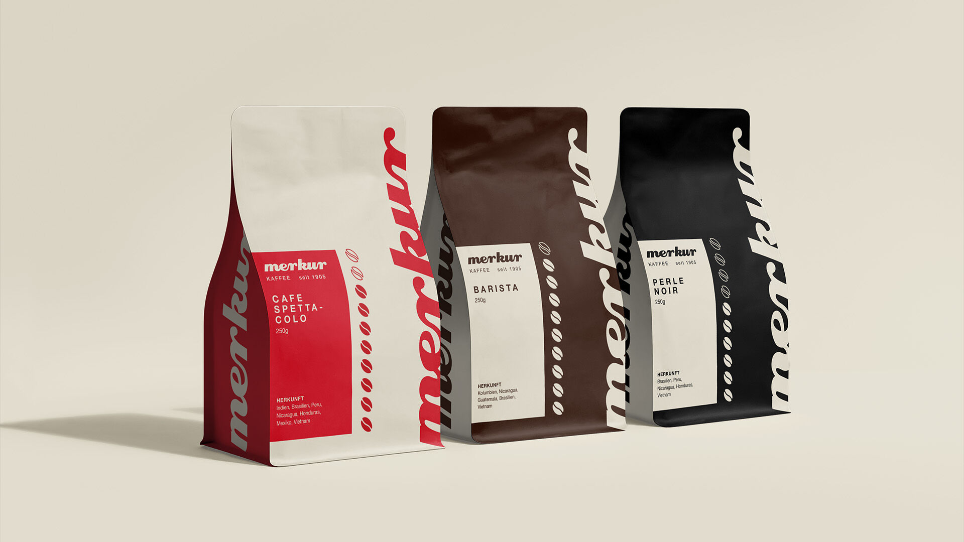
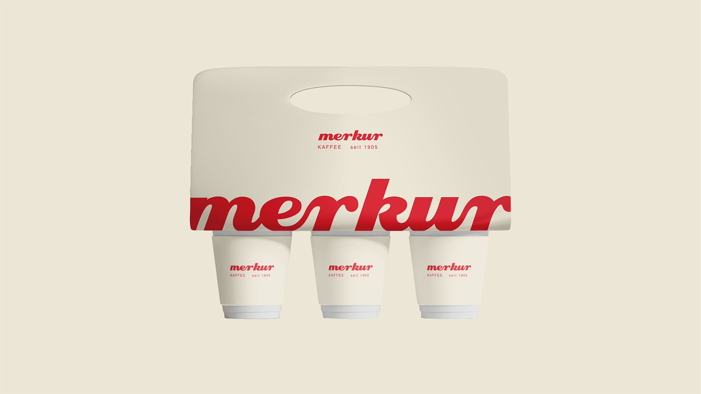
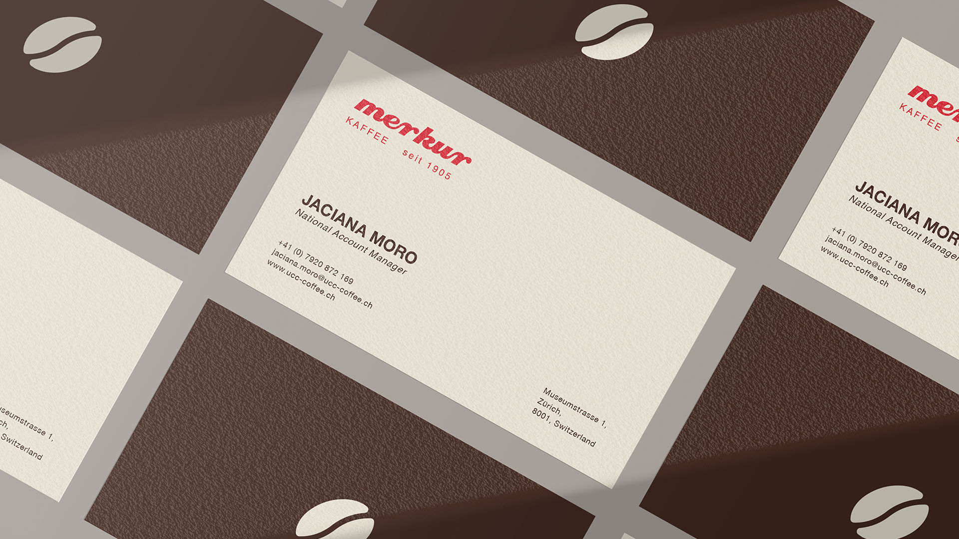
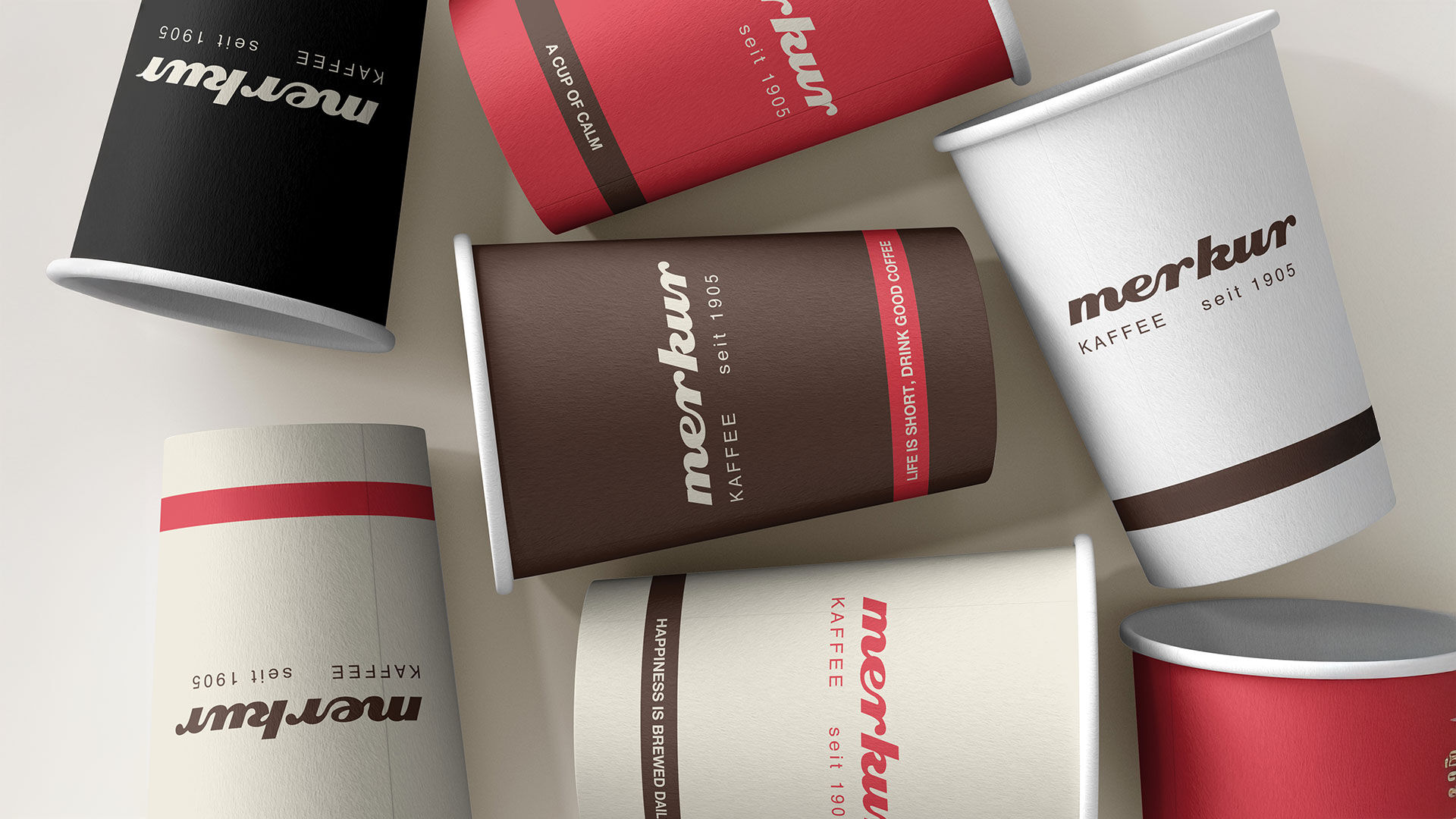
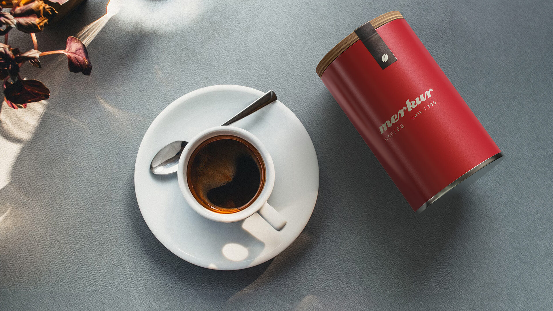
The color palette returns to the brand’s roots. A strong, refined red meets a warm cream tone. The result feels familiar yet current. On packaging, we replaced photography with a reduced graphic system. Coffee bean icons communicate strength at a glance and create clarity at shelf level.
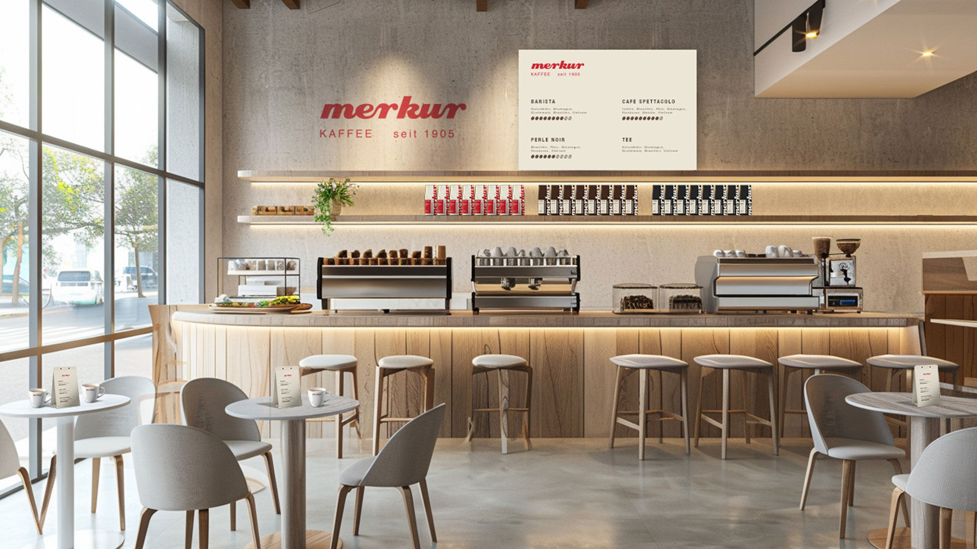
The outcome is a brand identity that treats tradition as an asset, not a constraint. Swiss coffee culture, translated into a focused design system that drives recognition and long term brand equity. show less
show moreThe new logo sharpens and simplifies the mark while preserving recognition. The typography subtly references the motion of pouring coffee, adding character without becoming decorative. The since 1905 byline anchors the brand in its legacy, supported by the deliberate use of Helvetica Neue as a Swiss typographic statement.
The color palette returns to the brand’s roots. A strong, refined red meets a warm cream tone. The result feels familiar yet current. On packaging, we replaced photography with a reduced graphic system. Coffee bean icons communicate strength at a glance and create clarity at shelf level.
The outcome is a brand identity that treats tradition as an asset, not a constraint. Swiss coffee culture, translated into a focused design system that drives recognition and long term brand equity. show less