RAYGIL
Rebranding & Packaging Design
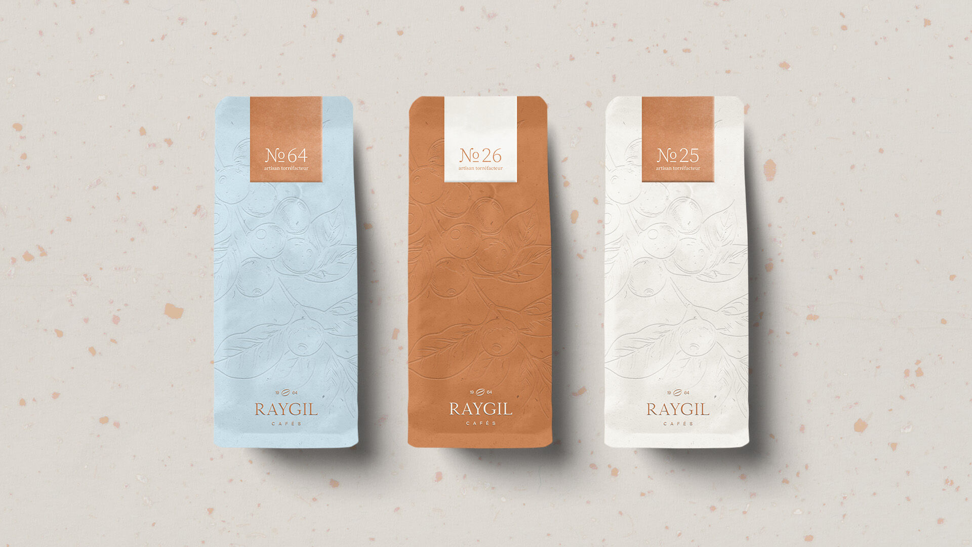
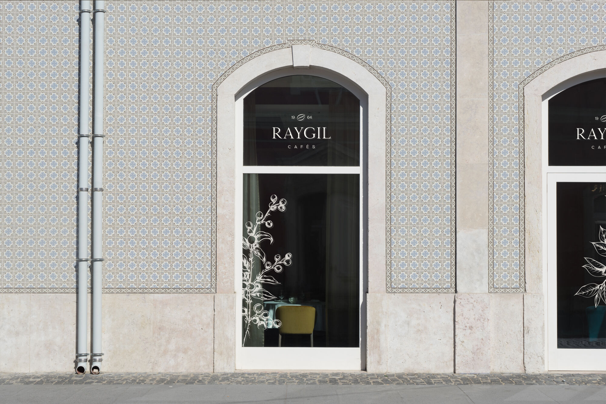
Raygil set out to reposition itself as a brand for contemporary luxury defined by minimalism. Not minimalism as a trend, but as an attitude. The goal was to respect the brand’s heritage while creating a modern brand experience that resonates emotionally with an audience that values quality and craftsmanship without the need for explanation.
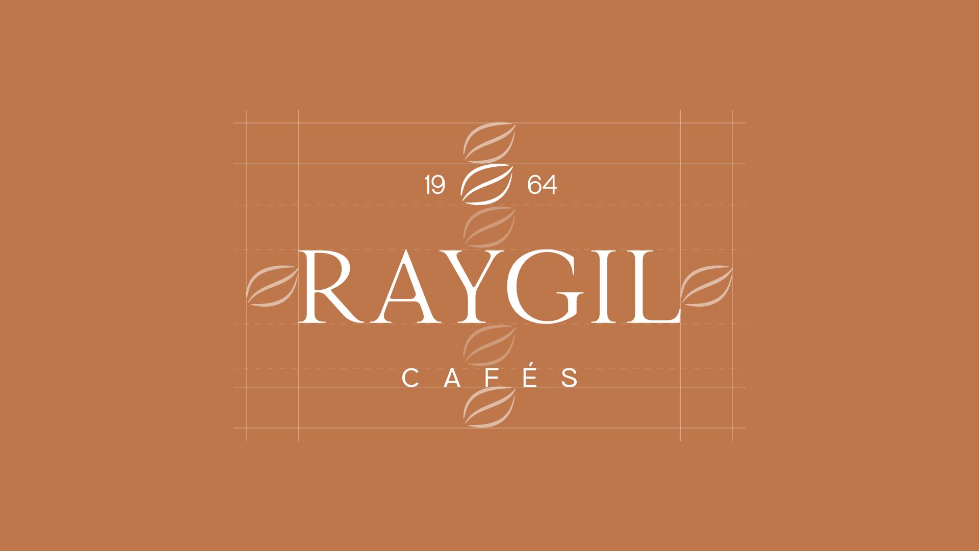
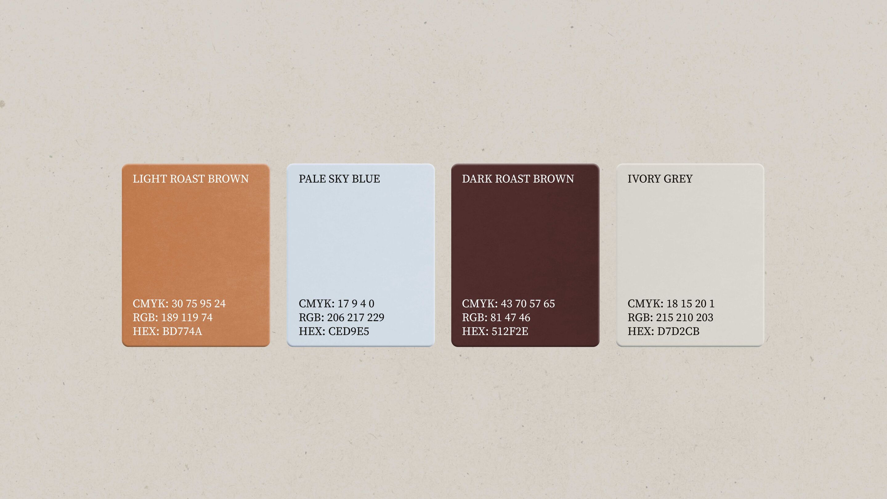
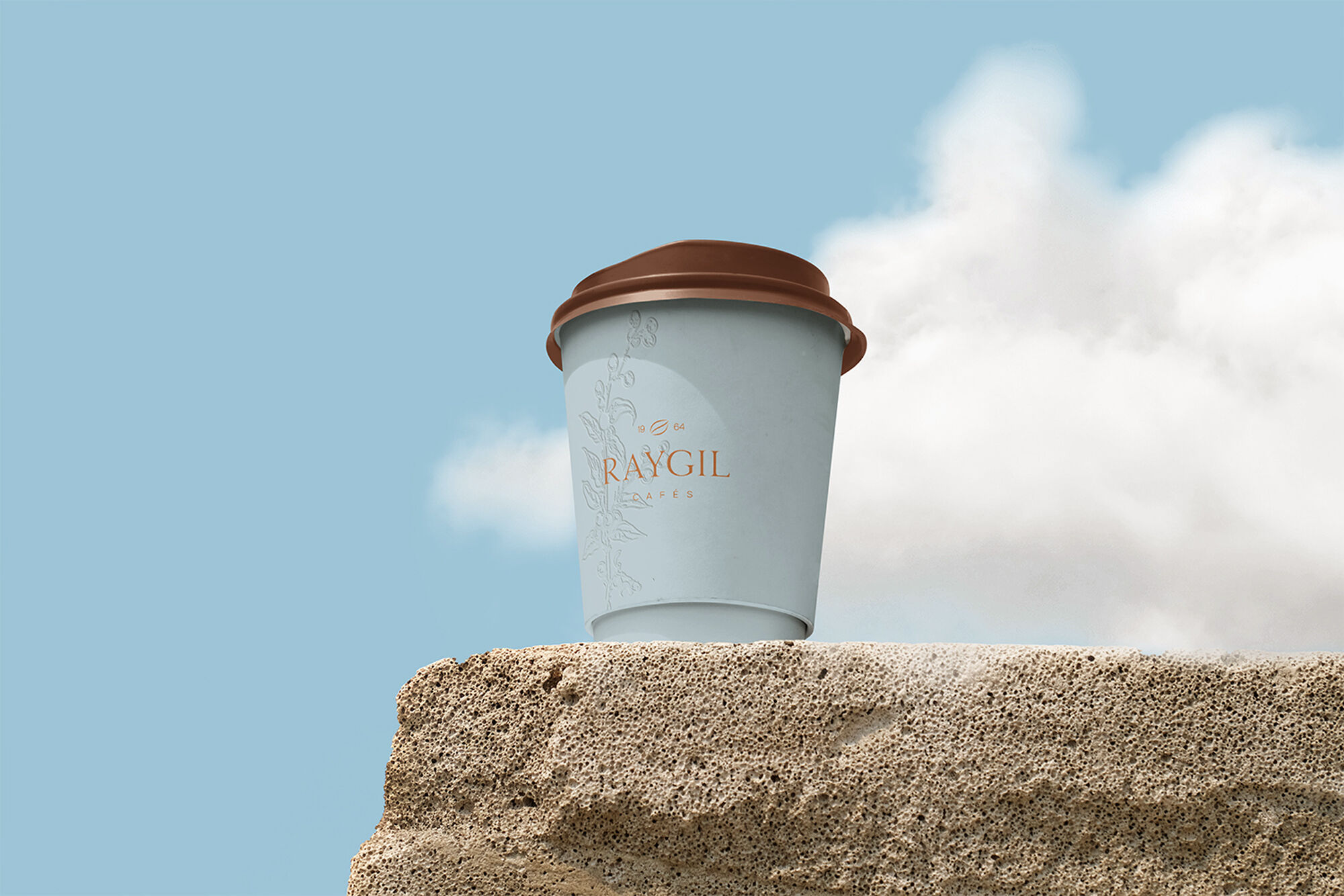
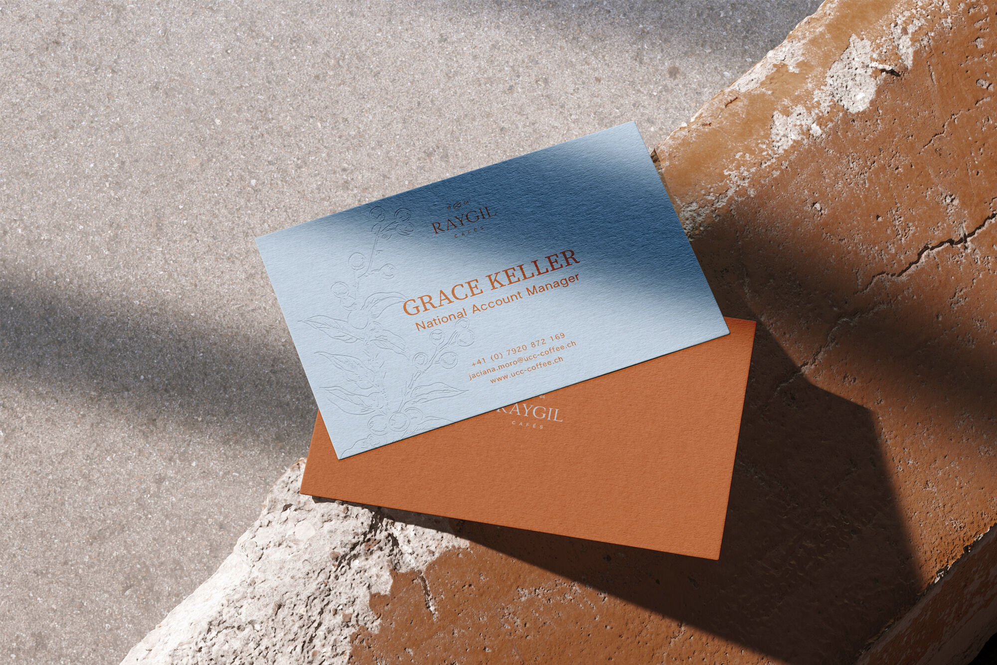
We developed a visual language that uses reduction as a strength. The logo is based on a refined serif typeface with generous spacing. The addition “Since 1964” anchors the brand in its history and reinforces credibility.
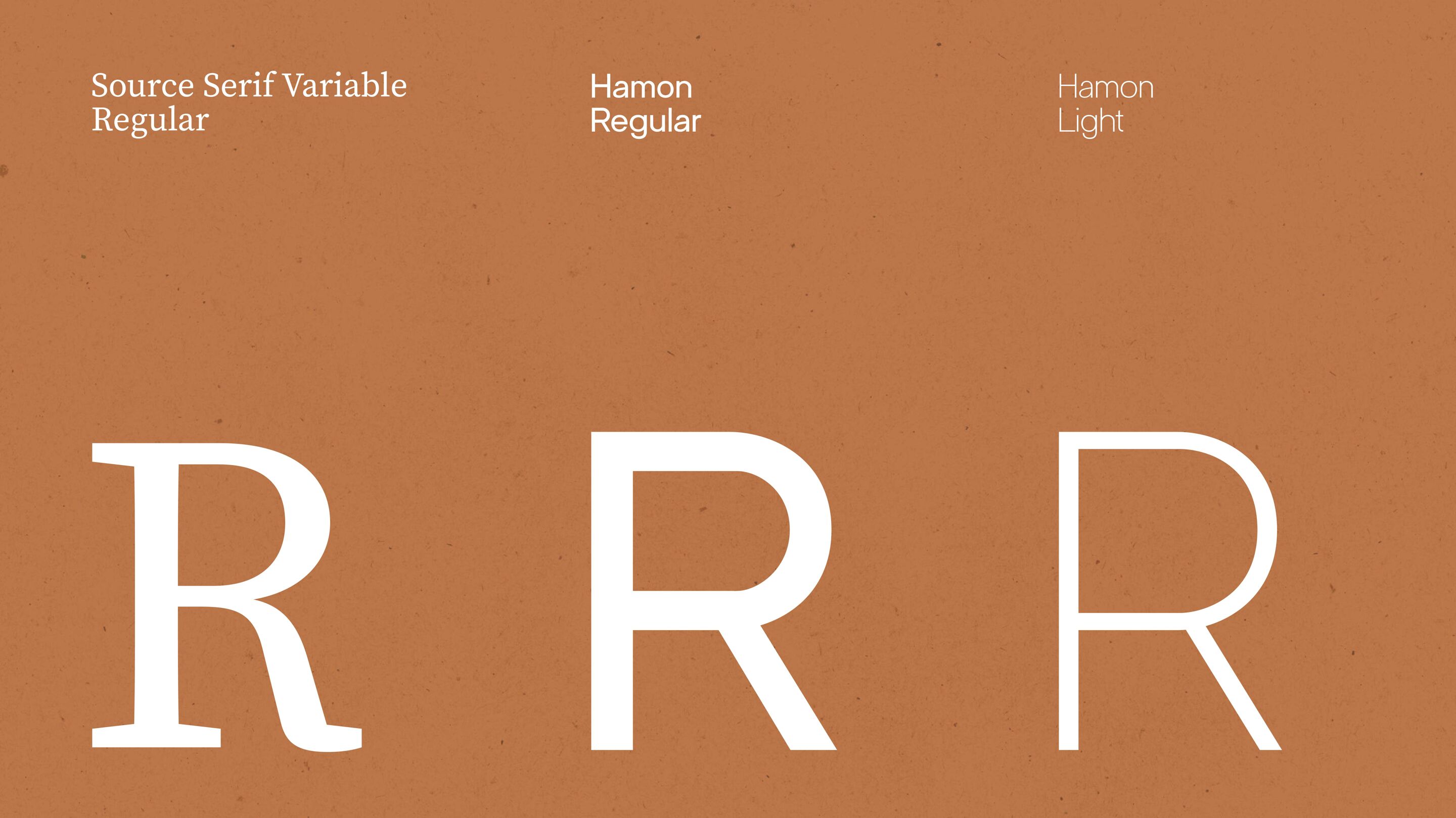
For typography, we combined Source Serif Variable for headlines with Hamon for body copy. Classical elegance meets contemporary clarity.
The result is an identity that does not decorate, but defines. Quiet in appearance. Strong in impact. show less
show moreWe developed a visual language that uses reduction as a strength. The logo is based on a refined serif typeface with generous spacing. The addition “Since 1964” anchors the brand in its history and reinforces credibility.
For typography, we combined Source Serif Variable for headlines with Hamon for body copy. Classical elegance meets contemporary clarity.
The result is an identity that does not decorate, but defines. Quiet in appearance. Strong in impact. show less