ROSCA CAFFÈ
Rebranding
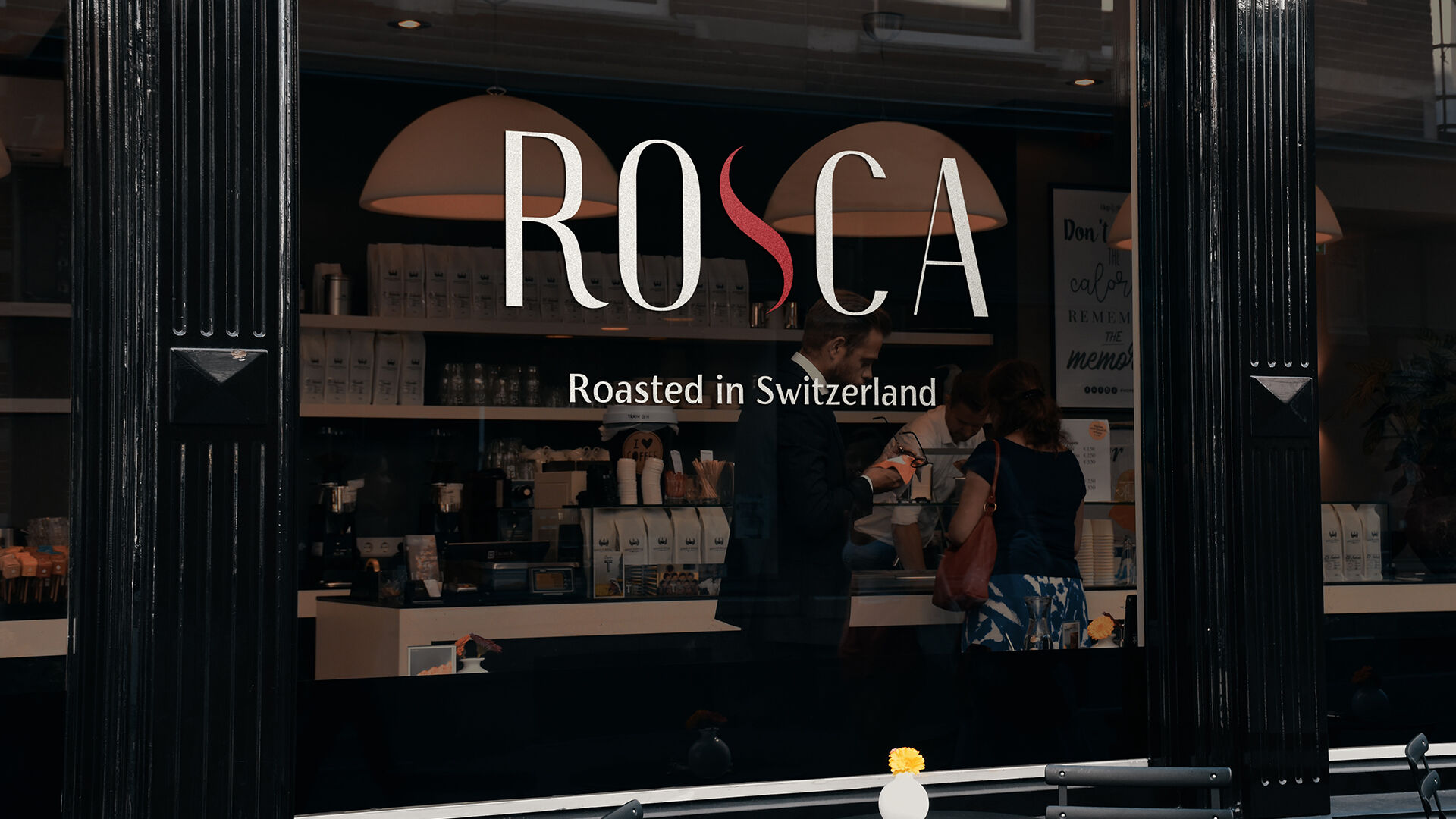
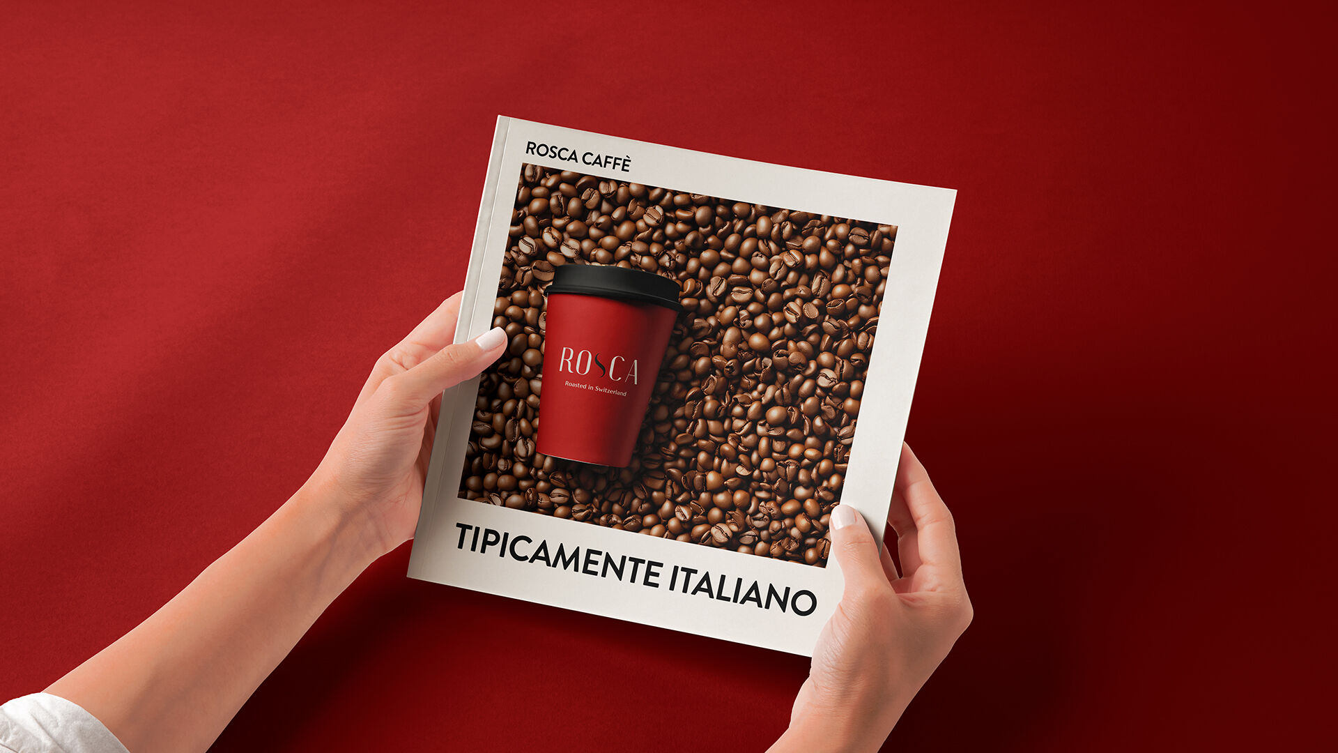
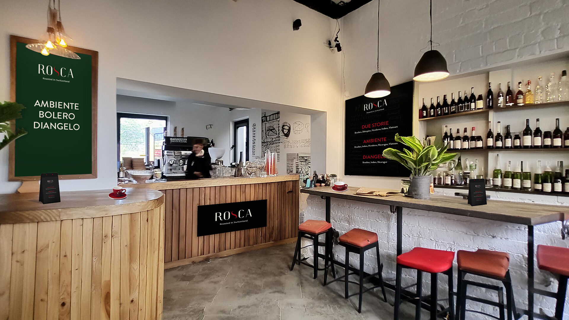
Rosca Caffè set out to leave its everyday image behind and step into a more elevated space. The ambition was clear. Italian soul paired with Swiss clarity. Craftsmanship, origin and quality had to become visible.
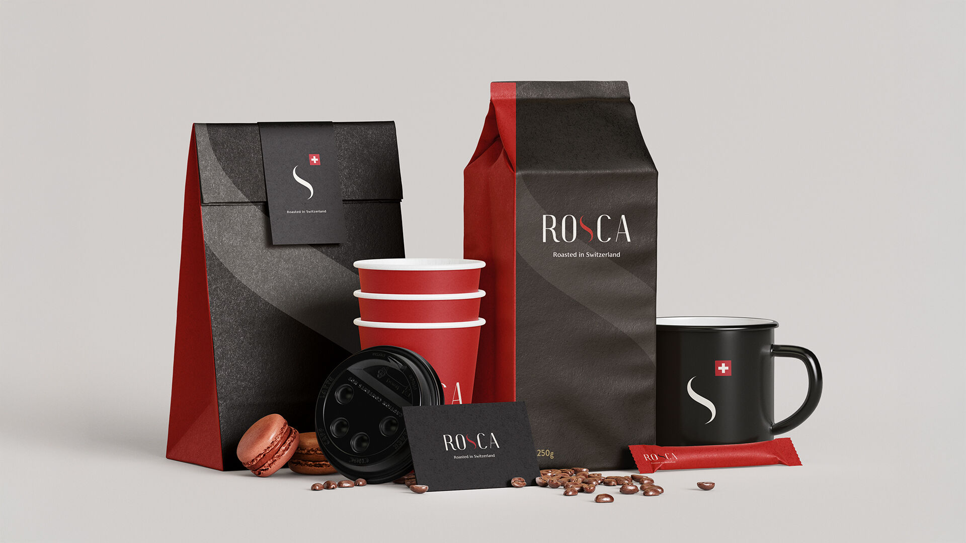
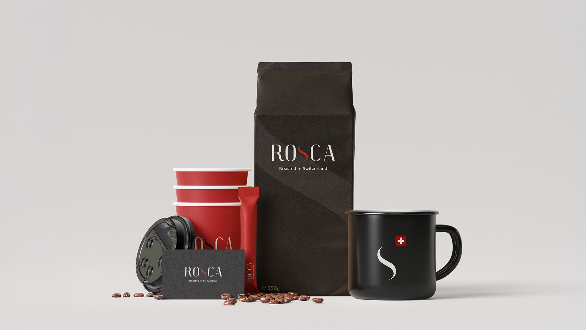
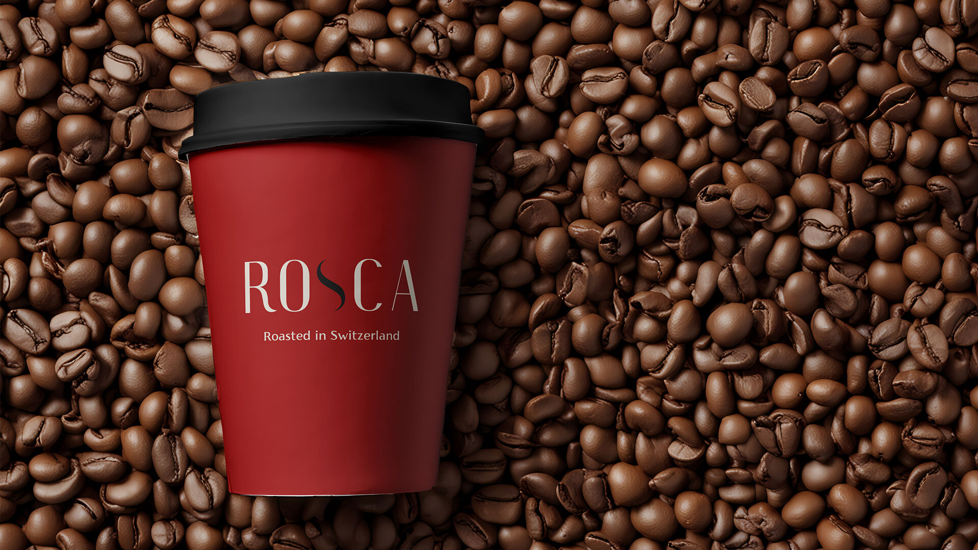
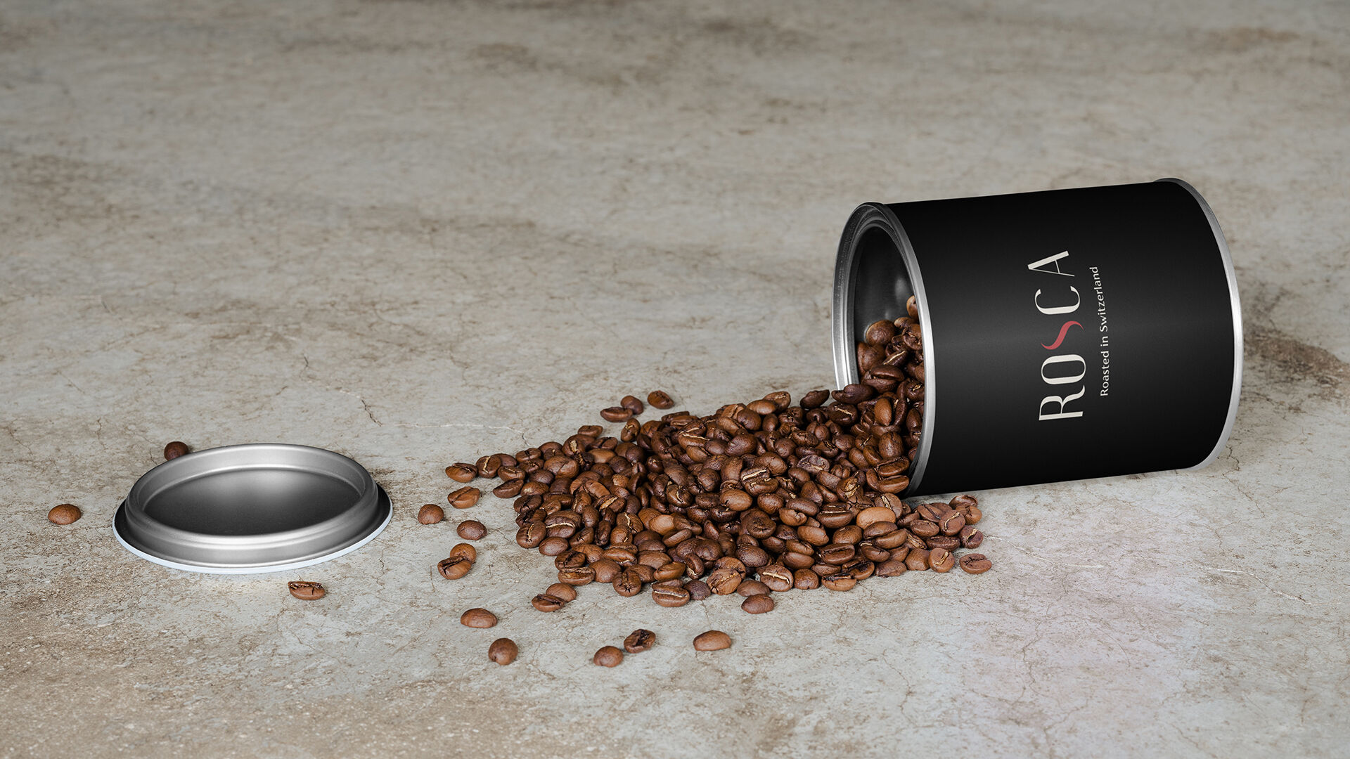
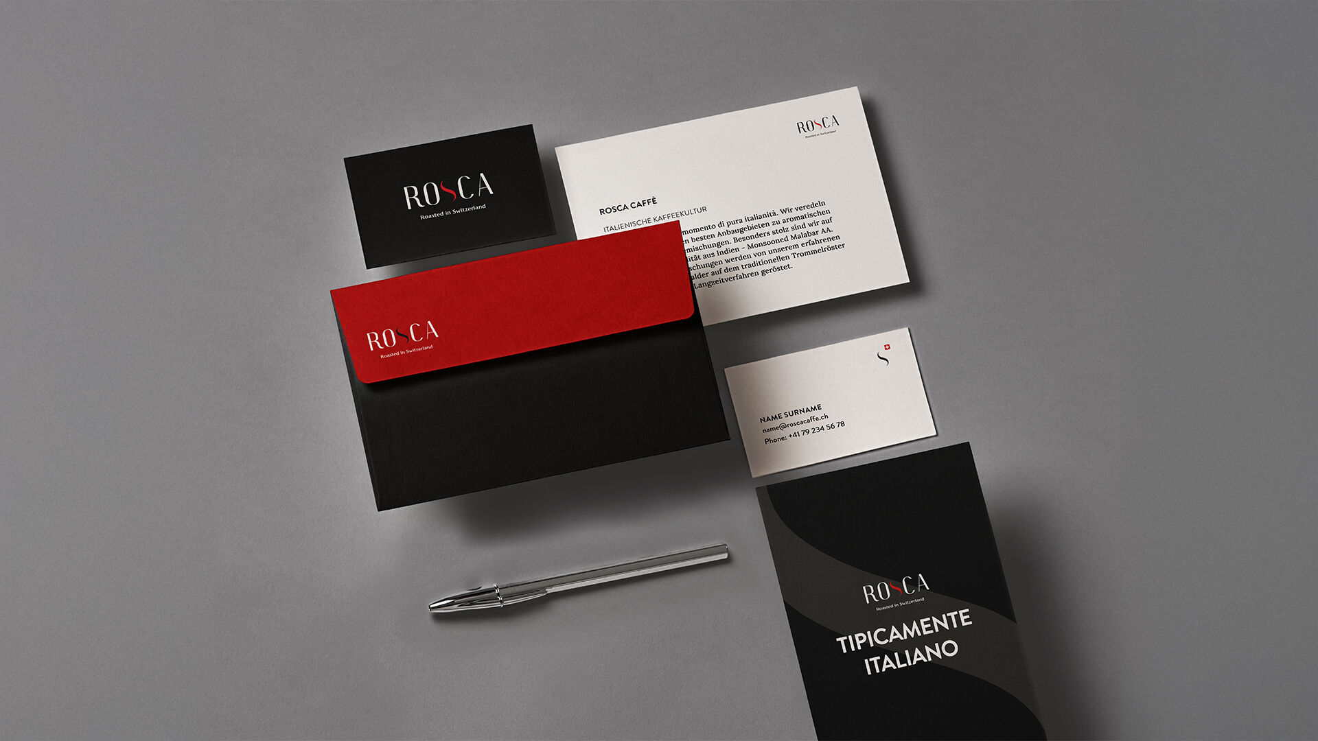
We translated this ambition into a complete rebranding. A new logo forms the core of the identity. At its heart sits an abstract S, derived from the original mark and refined into a stylised coffee bean. A subtle evolution that respects the past while sharpening the premium claim.
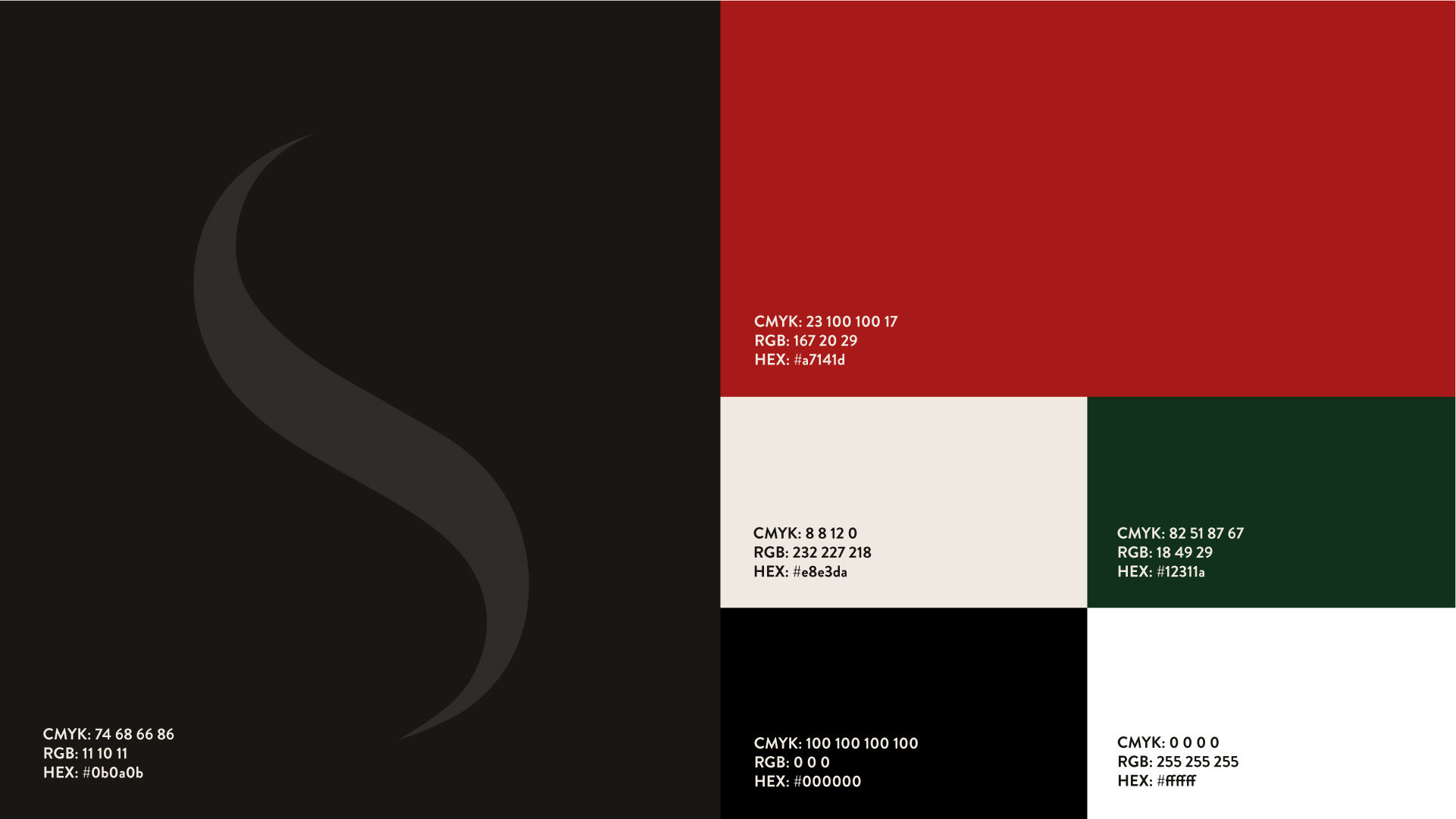
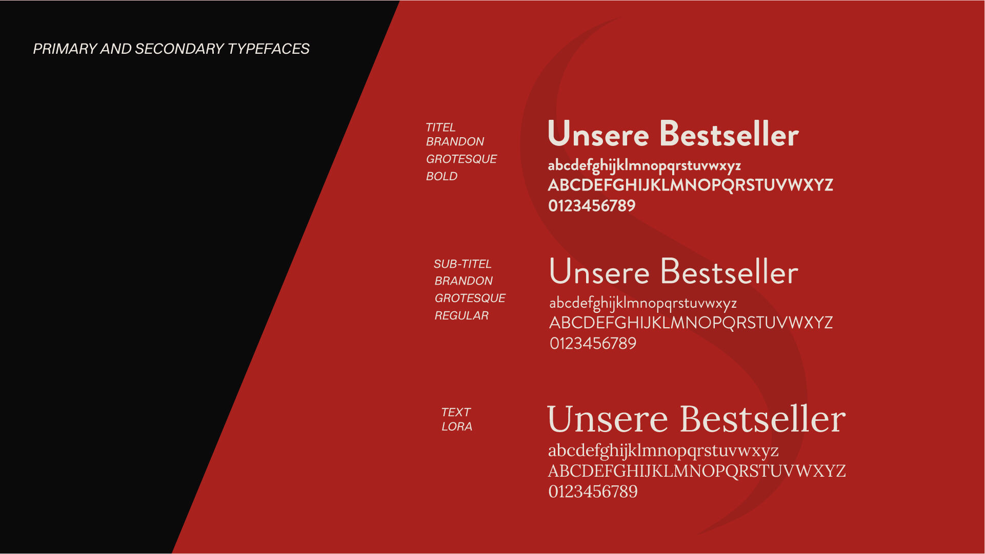
The colour palette builds on deep black and warm cream, complemented by a distinctive red. A quiet nod to the Swiss cross and at the same time a reference to Italian warmth. The typography balances structure and finesse, giving the brand a calm, contemporary presence.
The result is a cohesive CI and CD system that positions Rosca Caffè as a distinctive coffee brand. Rooted in origin. Clear in attitude. Designed with intent. show less
show moreWe translated this ambition into a complete rebranding. A new logo forms the core of the identity. At its heart sits an abstract S, derived from the original mark and refined into a stylised coffee bean. A subtle evolution that respects the past while sharpening the premium claim.
The colour palette builds on deep black and warm cream, complemented by a distinctive red. A quiet nod to the Swiss cross and at the same time a reference to Italian warmth. The typography balances structure and finesse, giving the brand a calm, contemporary presence.
The result is a cohesive CI and CD system that positions Rosca Caffè as a distinctive coffee brand. Rooted in origin. Clear in attitude. Designed with intent. show less